
you nique life services
logo | styleguide
the brief:
The client is a community support services consultant and carer who works closely with NDIS participants and their families, assisting them in navigating and selecting the best support services for their needs.
It’s a personal caring service, all about the individual and their unique needs. Inclusion, kindness and care were words they wanted conveyed in the design. They also had a strong preference for earthy tones to convey warmth and sincerity.

The Solution:
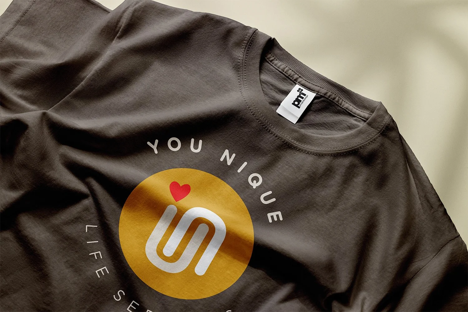
I explored the letter U as a symbolic reference to the word You, and in using a very simple letter form, it could be viewed as looking down on open arms, suggesting warmth and a welcoming and nurturing vibe. I then flipped the U to introduce an N to reference ‘Nique’ and in doing so revealed a visual coupling that referenced a hug, inclusion and care. Feeling the design was visually too clinical, I added a heart to reference the human element, together with warmth, care and love.


The Result:
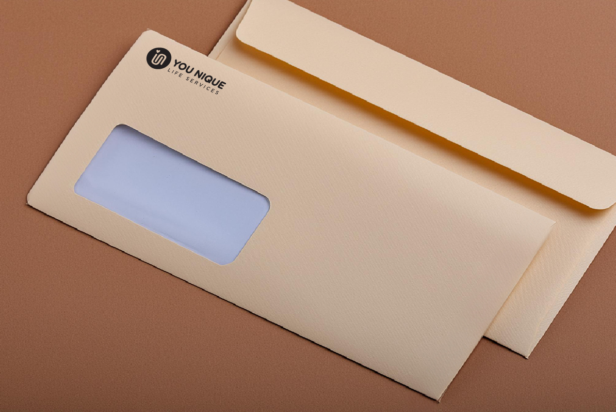
A super simple, iconic visual with a whole lot of meaning that, according to the below words, the client loved.
client feedback:
I LOVE, L o V e, Looove my logo and all the work you have done. Big thanks…..