Christine berry coaching
logo | colour palette | website | image creation
the brief:
Christine Berry approached pm3 with an existing logo and website she had created herself. While these had served her well, she recognised the need for a more professional and considered brand expression.
Having collaborated with Christine on four previous brands, we had already established a strong, intuitive working relationship. Christine’s broad, idea-led verbal briefs and entrepreneurial mindset are balanced by a high level of trust—allowing me to read between the lines, propose ideas well beyond those initially articulated, and take creative ownership of the details.
For a designer, this level of trust is incredibly freeing, and the outcome reflects that collaborative confidence.
The Solution:
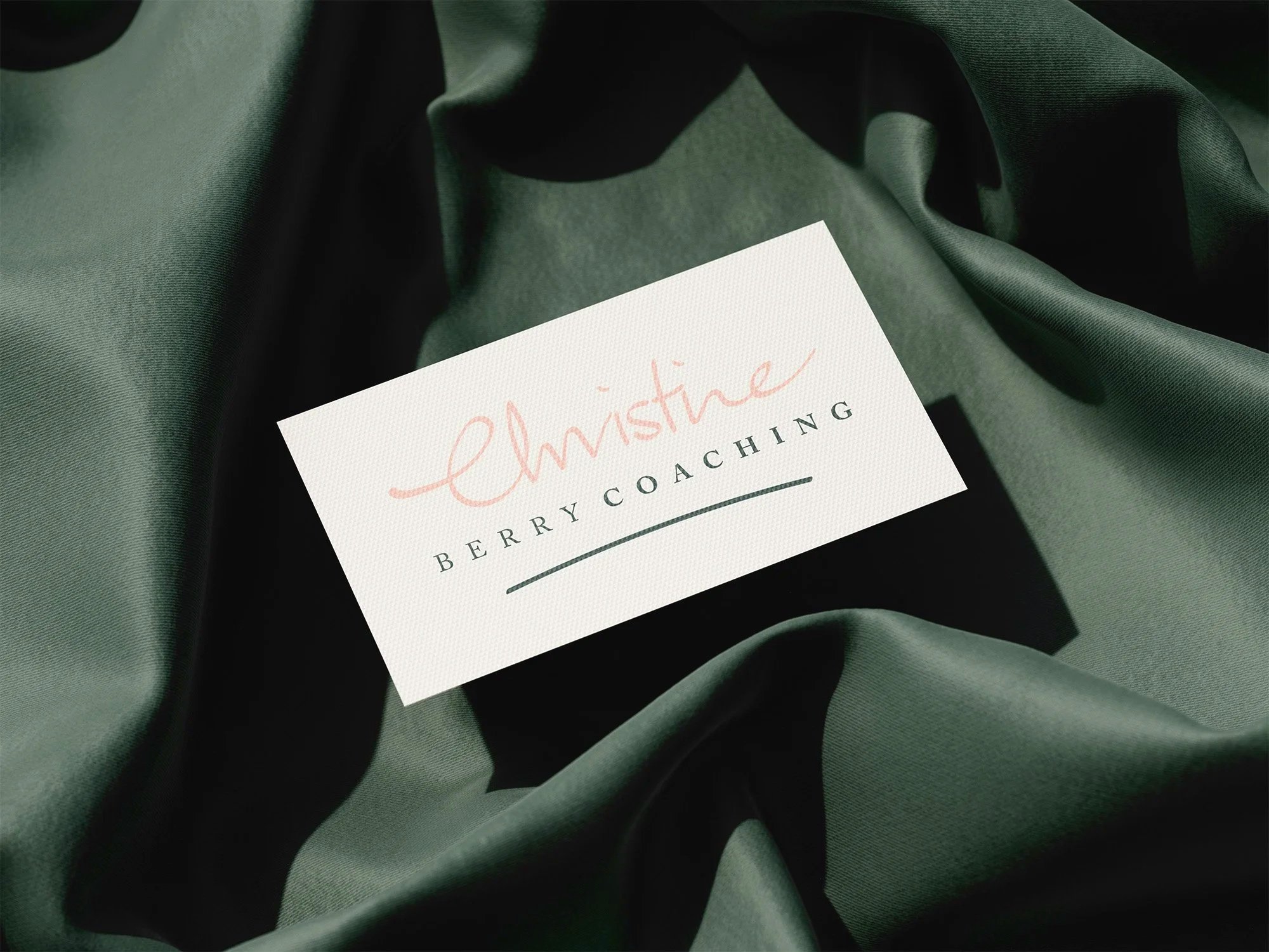
The first priority was to replace the existing logo—created using a combination of Canva fonts—with something more distinctive and more authentically aligned with Christine as a person. This was achieved by refining Christine’s own handwriting and pairing it with a timeless, elegantly spaced serif typeface.
Clients DIY logo

Clients handwriting
“Christine Berry Coaching” presents a natural challenge: it is a long name that demands careful visual and spatial consideration. Strategic compromises were necessary. Dropping the surname to a second line was one solution; differentiating it visually from Coaching was another. While letterspacing an already long line of text may seem counterintuitive, it created the required contrast between the single-word first line and the supporting second line.
After exploring multiple iterations, this approach delivered the strongest and most balanced result.
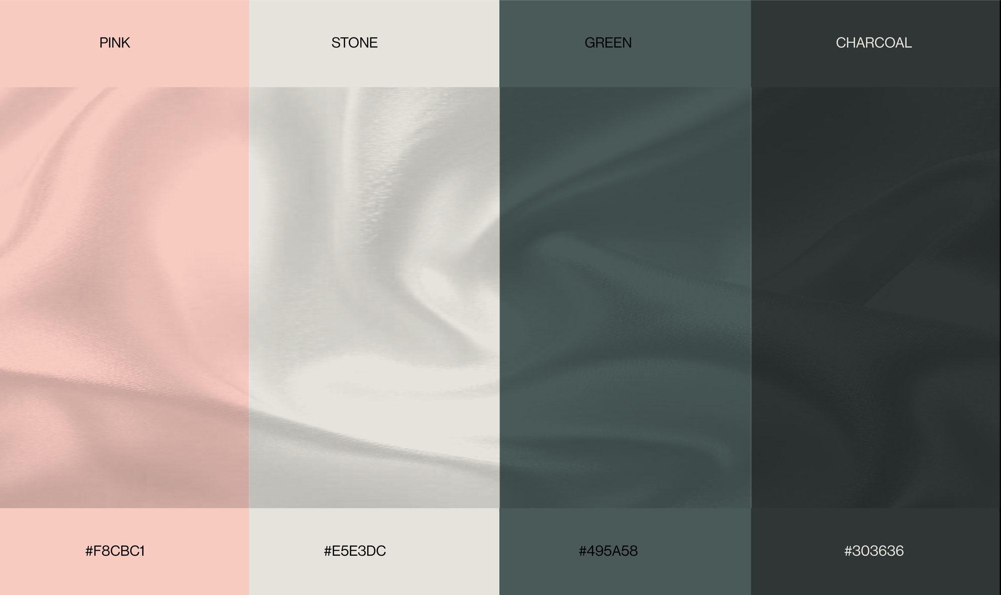
The colour palette was chosen intuitively and sat well outside Christine’s initial suggestions. Trusting that instinct proved worthwhile—the palette was immediately embraced and became a defining feature of the brand.
The Result:
A brand that balances warmth, femininity and strength, infused with subtle spiritual graphic elements while remaining professional and credible—clearly resonating with its female audience.
client feedback:
“What a beautiful site, honestly one of the best websites I’ve ever seen… clear simple beautiful colour palette and images. Well done!”