wheelers books
brand development | website styling | flyers & brochures | banners | merchandise
the brief:
Wheelers engaged pm3 with an established logo, typefaces, colour palette and multiple websites—separate platforms for Australian schools, New Zealand schools and the corporate site. While they were satisfied with these individual components, they recognised that they did not yet constitute a cohesive brand. Further design development was required to bring everything together.
Wheelers identified the need for a tagline as a key next step. The initial brief was therefore to rework the logo to incorporate a tagline, alongside the development of a suite of graphic assets that would unify the existing elements and clearly articulate the brand.
Before

After
The Solution:
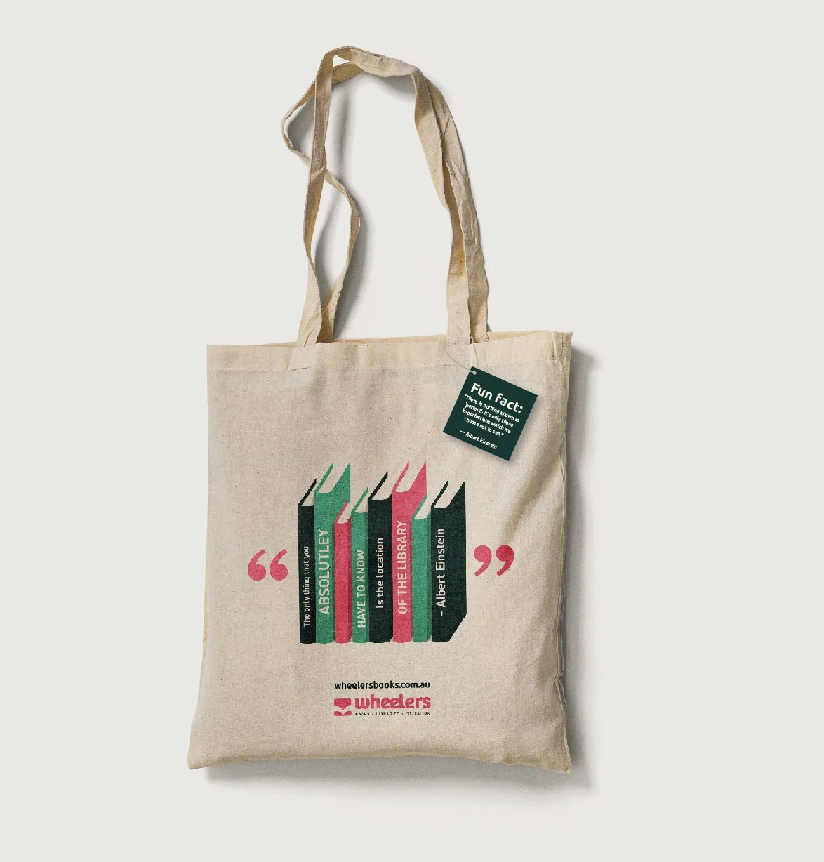
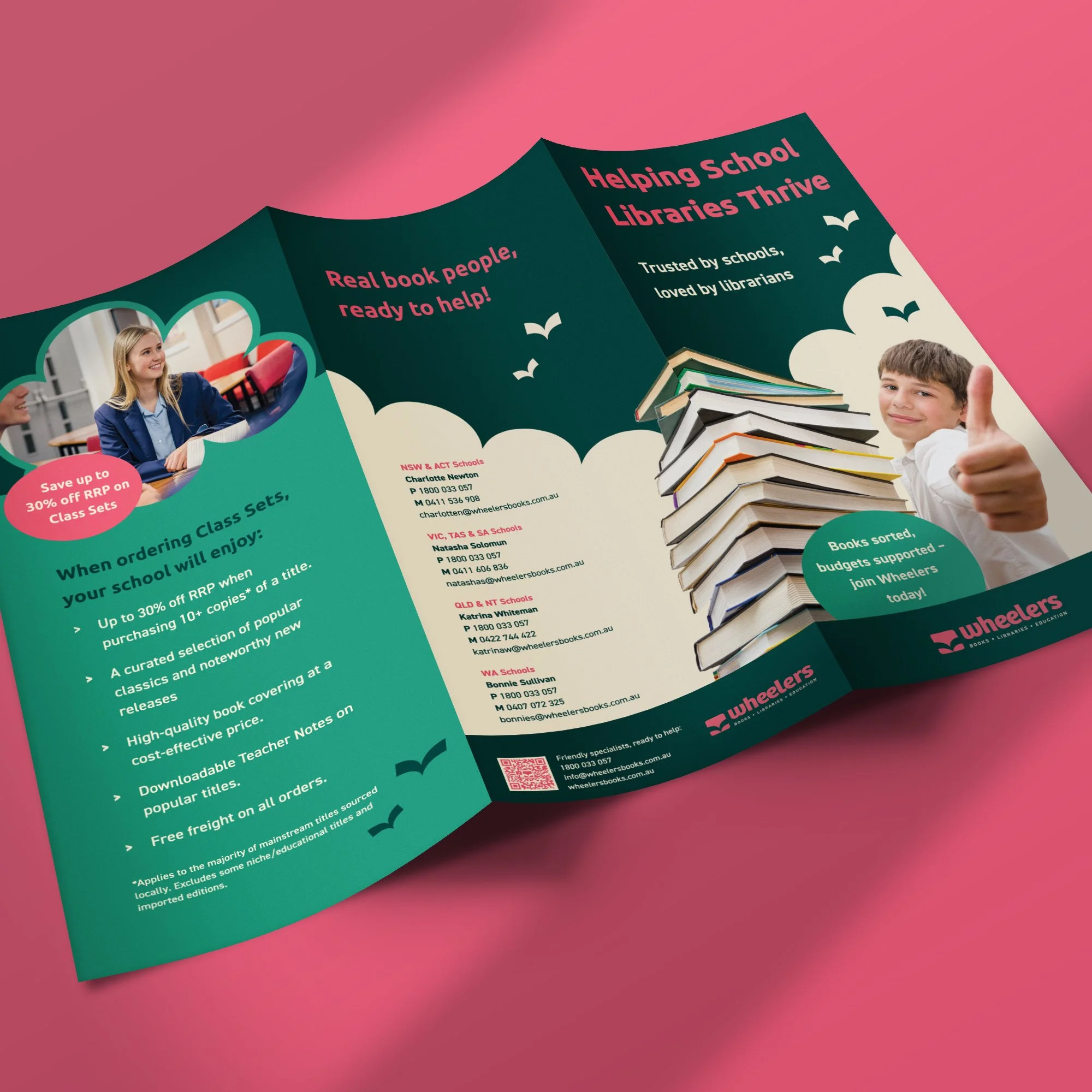
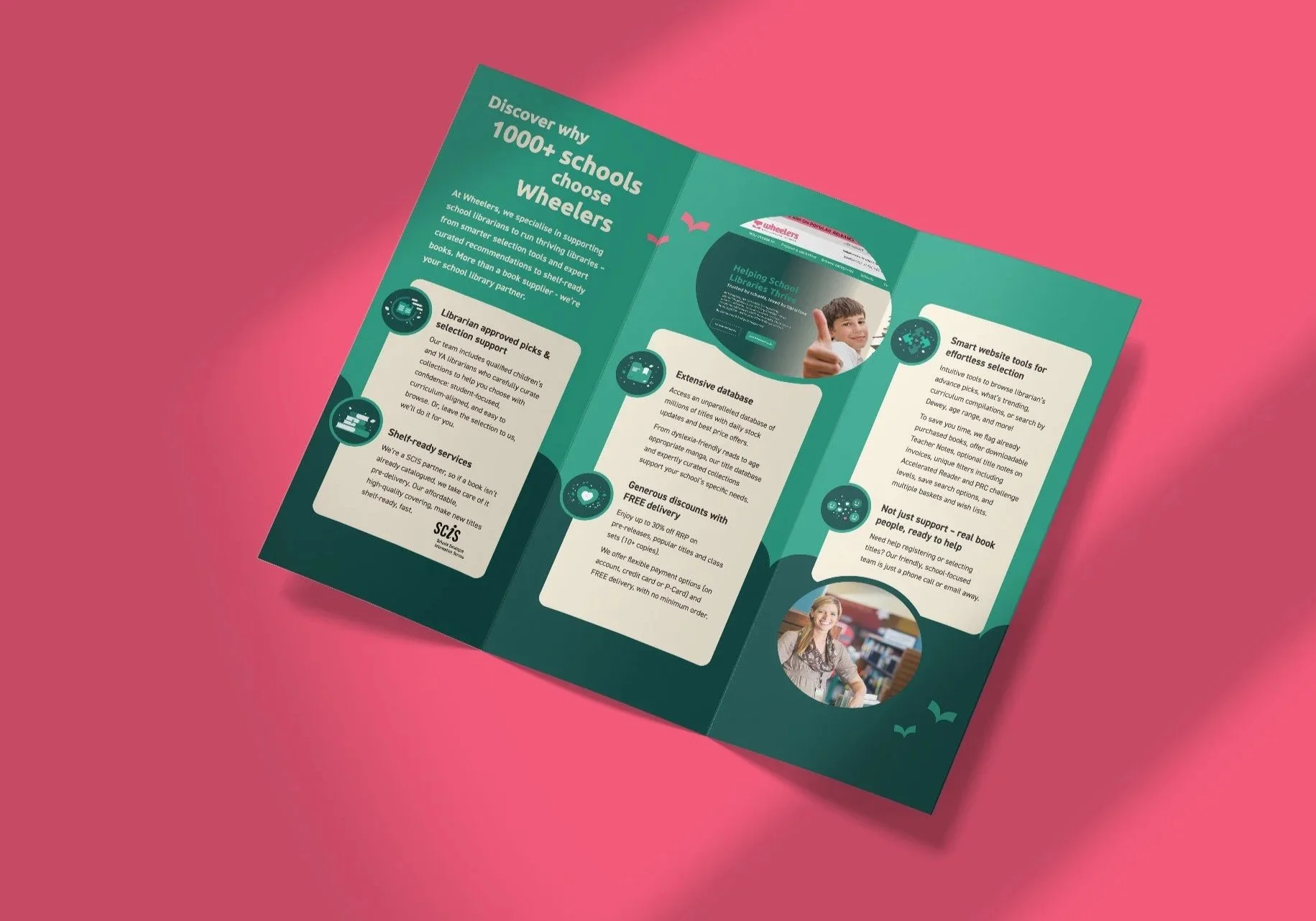
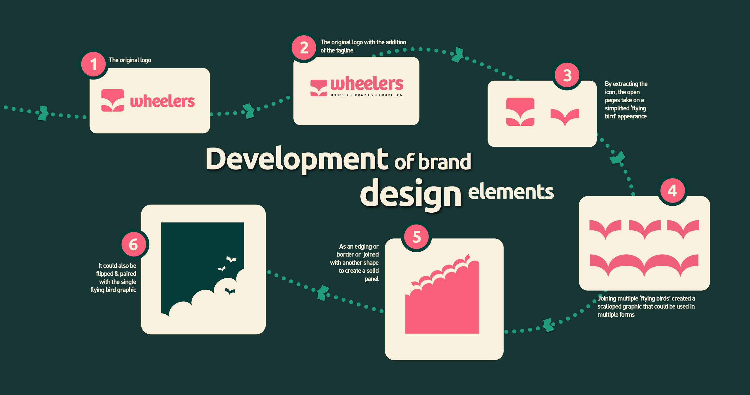
The logo featured a fairly generic open-book icon; however, when deconstructed, it revealed a range of shapes that could be repurposed as distinctive design elements. The open book was reinterpreted into a simplified flying bird. By repeating and combining these bird forms, a scalloped graphic emerged.
This scalloped motif proved highly versatile—it could be used as a border, combined with other shapes to form solid blocks, or paired with the flying bird to add playfulness and visual interest. Together, these elements created a flexible visual language that resonated with the brand’s audience of students, librarians and educators.

The Result:
A playful, colourful and engaging brand system that encourages a love of reading and appeals equally to students and educators.
client feedback:
Many thanks Prue, this looks great.. love your work.. the brand designs provided are excellent!!