
Sockfort
logo | brand identity | art direction | packaging | website | socials | print ads
the brief:
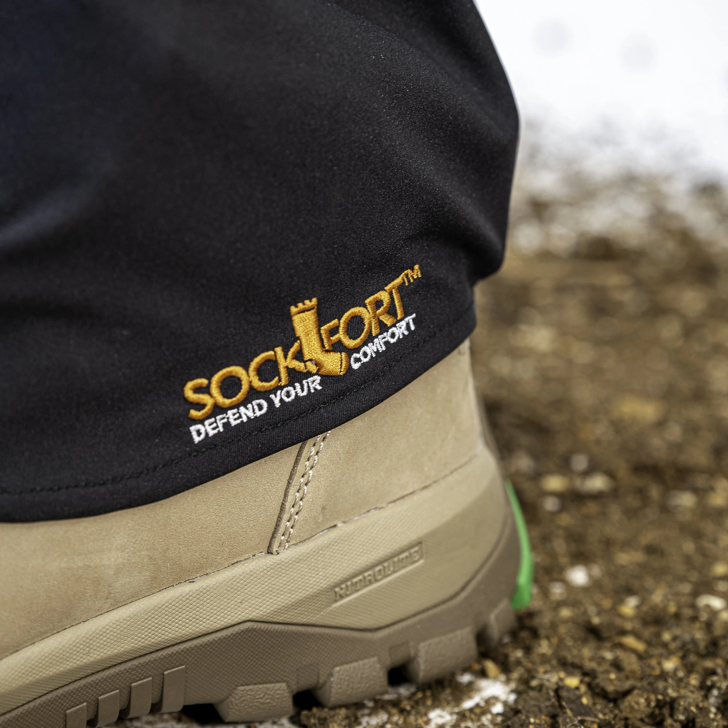
To be honest, there wasn’t really much of a brief. The client was referred to pm3 by a trusty colleague who must have said good things because the client pretty much put his faith into pm3’s experience and know-how and left me to it. The product is an all-in-one gaiter and sock designed for tradies, landscapers, farmers and anyone who works outside – providing comfortable protection for feet and work boots, while at work.

the solution:
Given the name is a combo of ‘sock’ & ‘fort’ the design cried out for a visual that conveyed exactly that – so, I literally drew a sock with a fort-like top and voilà the logo was done – well the concept was done, there was much styling and tweaking to do to integrate the icon into the wording, together with sourcing a suitable font and colours. I also presented alternative concepts but like me, the client couldn’t go past the visual representation of a sock and fort.


the result:
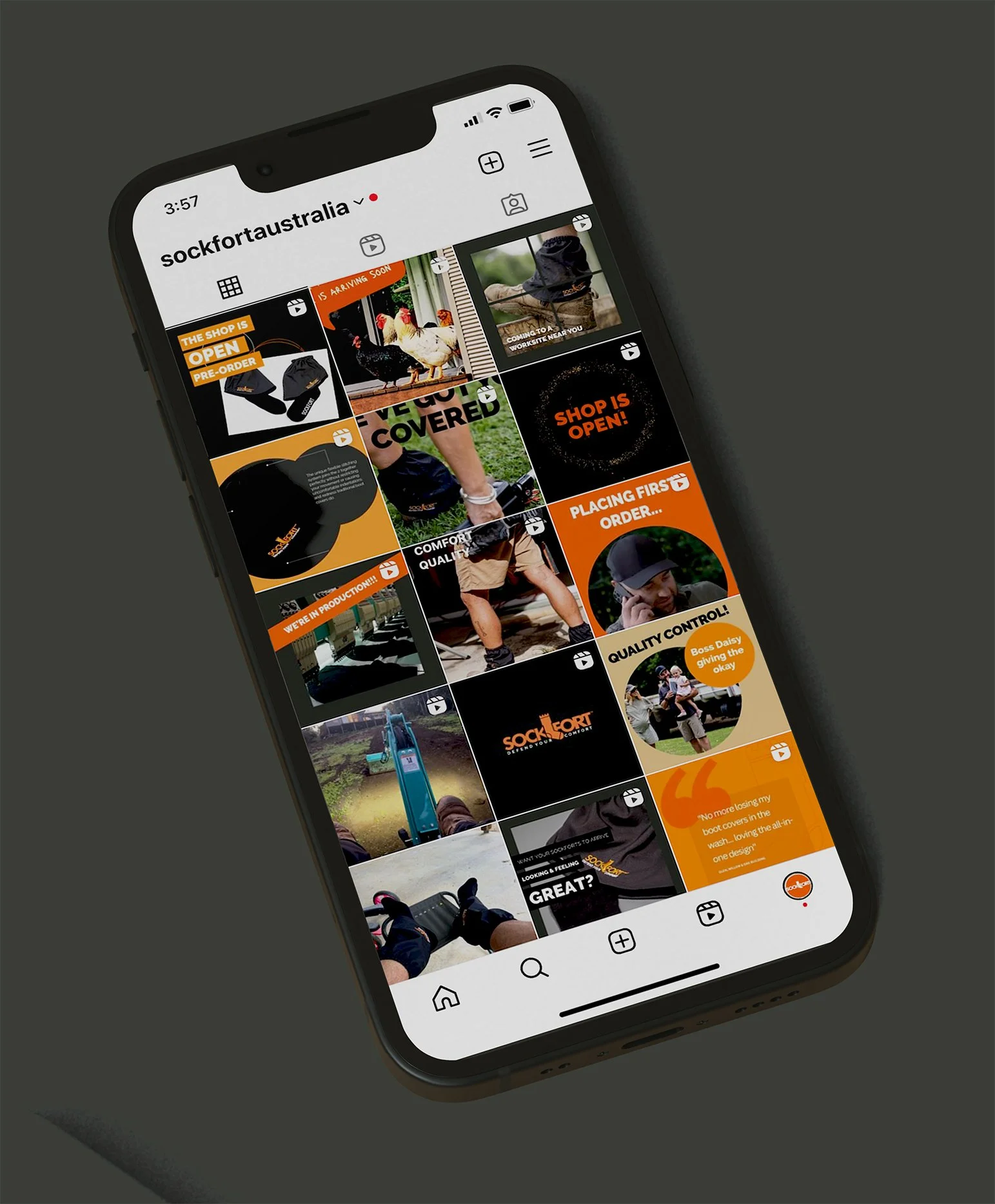
A crisp clean strong brand that hopefully speaks to tradies and outside workers of all types.
client feedback:
“l think you are amazing! Very impressed with your presentation and ideas. l can really see my socks in shops looking so professional. l’m soaking in all the ideas and waiting to see what final thoughts and script comes together. Thank you so much”
