my gut store
logo | brand identity | packaging | Stationery | social banners
the brief:
My Gut Store is the brainchild of herbalist and nutritionist Belle Eder. She offers consultation and coaching to help clients improve their gut health.
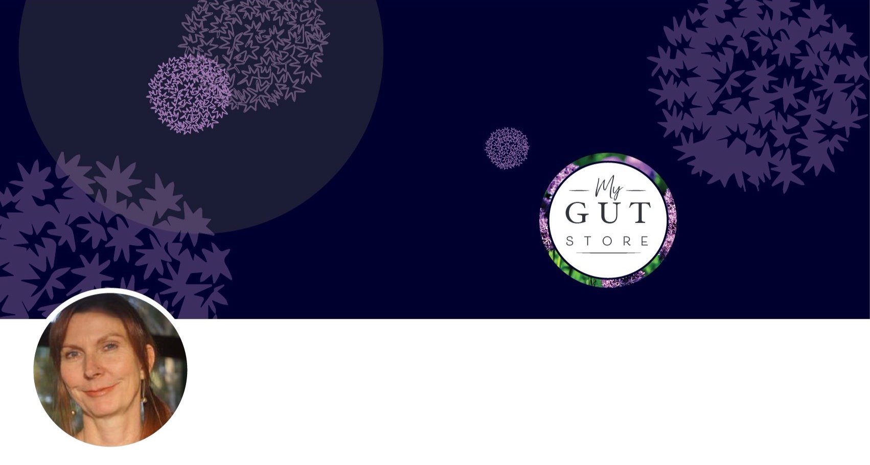
Belle researched brand styles and colour palettes to provide a short list of what she was drawn to. Purples, greens and a garlic flower were all on the wish list for a simple, feminine and most importantly, clean and professional logo.
the solution:
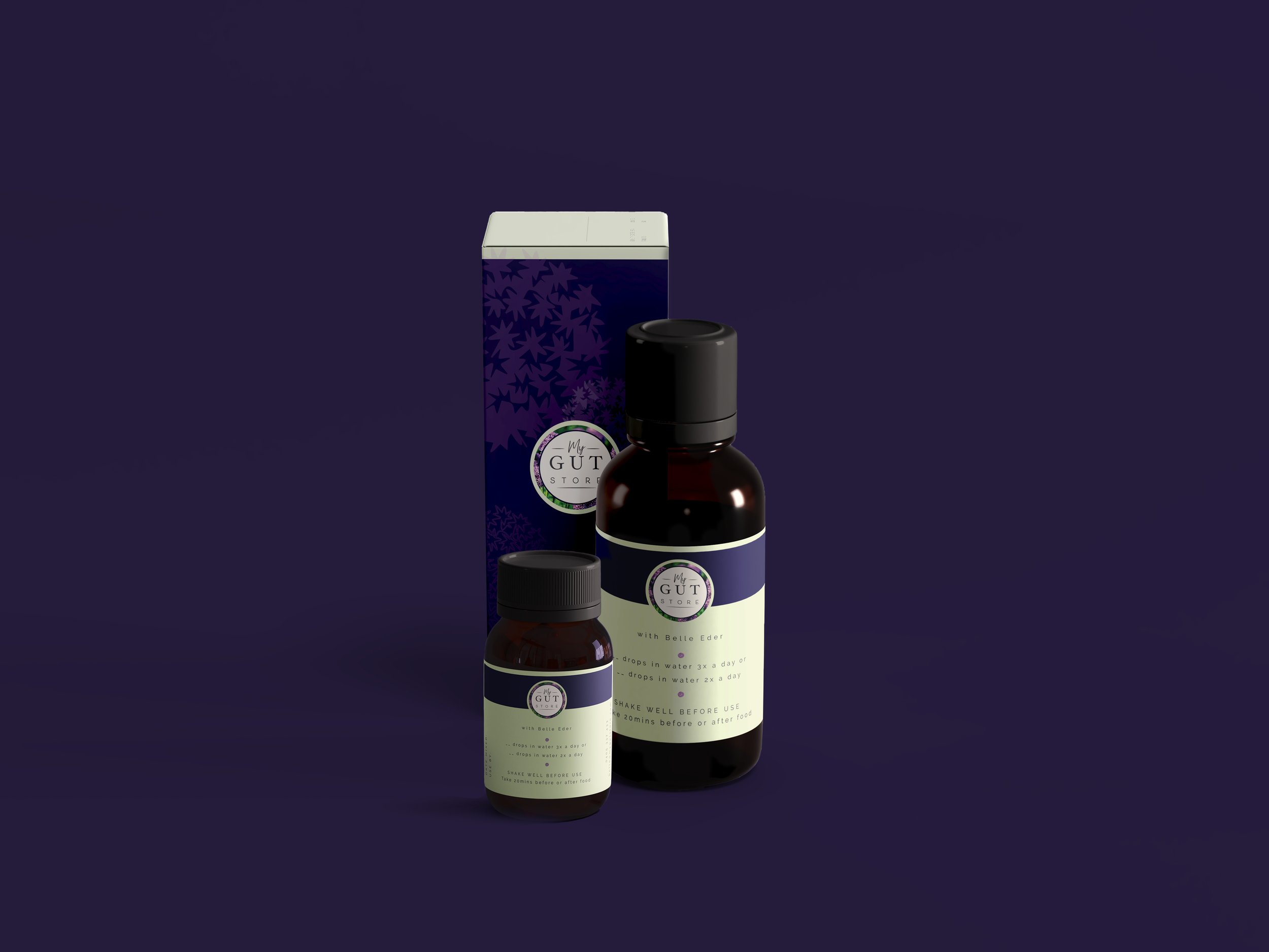
After exploring a variety of typographic solutions with stylised graphics of garlic flowers I arrived at an incredibly pared back typographic circular solution. To be honest it was bordering on too simple for my liking, so I introduced a photo of garlic flowers into the border and bam – the design was elevated to the next level.
The stylised graphics of garlic flowers I incorporated into the packaging, stationery and banners, which translate perfectly as a reflection of the garlic plant and its use in medications.

client feedback:
“I love it. It makes my heart sing every time I look at it. Love your work!”
The Result:
At pm3 I aim to create conceptual designs however, in this case less is more and this simple typographical solution, packs a powerful punch in prettiness. Combining nature and apothecary in one.