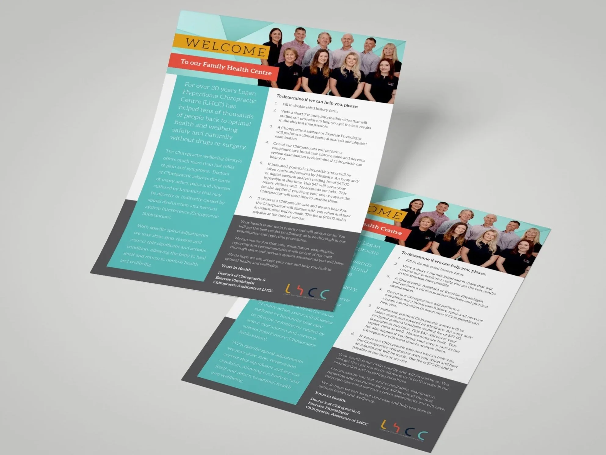
logan hyperdome chiropractic centre
logo | signage | posters | ads | brochures | flyers | stationery | book
the brief:
To create a new look that is visually clean, simple and contemporary, avoiding the very clichéd visual reference to the human spine. LHCC provides a professional, experienced health support service and wanted this to be reflected in their logo and visual brand.

The Solution:
Choice of colour was made to reflect ‘clinical and professional’ without looking too conservative nor medical.
The clean letter forms came from playing around with the acronym and modifying an existing font to suit.

the result:
An eye catching, contemporary and particularly versatile design that enables a seamless flow across a range of media. The client loved the look and feel of the new design and impressed by the way it captured how they felt about their business.
client feedback:
“Despite Prue and I growing up together, I never really appreciated what her job was about until I showed her the logo concepts our web developer had presented for our clinic rebrand. We were happy enough with them until Prue sent through a proposal demonstrating how she would approach the rebrand. I knew right then, we needed to hand the job over to her. She totally nailed the brief and we’ve been working together ever since.”