Case study
brand development - Bek Park
Bek and I have been working together since 2018. Lucy Ashley of Shuck Oyster fame recommended me in response to a call from Bek who was looking for a graphic/web designer who worked in Squarespace. Bek was building a client site built in Squarespace and needed help with the styling. Since then I’ve helped her with her own website as well as her business logo and brand design.
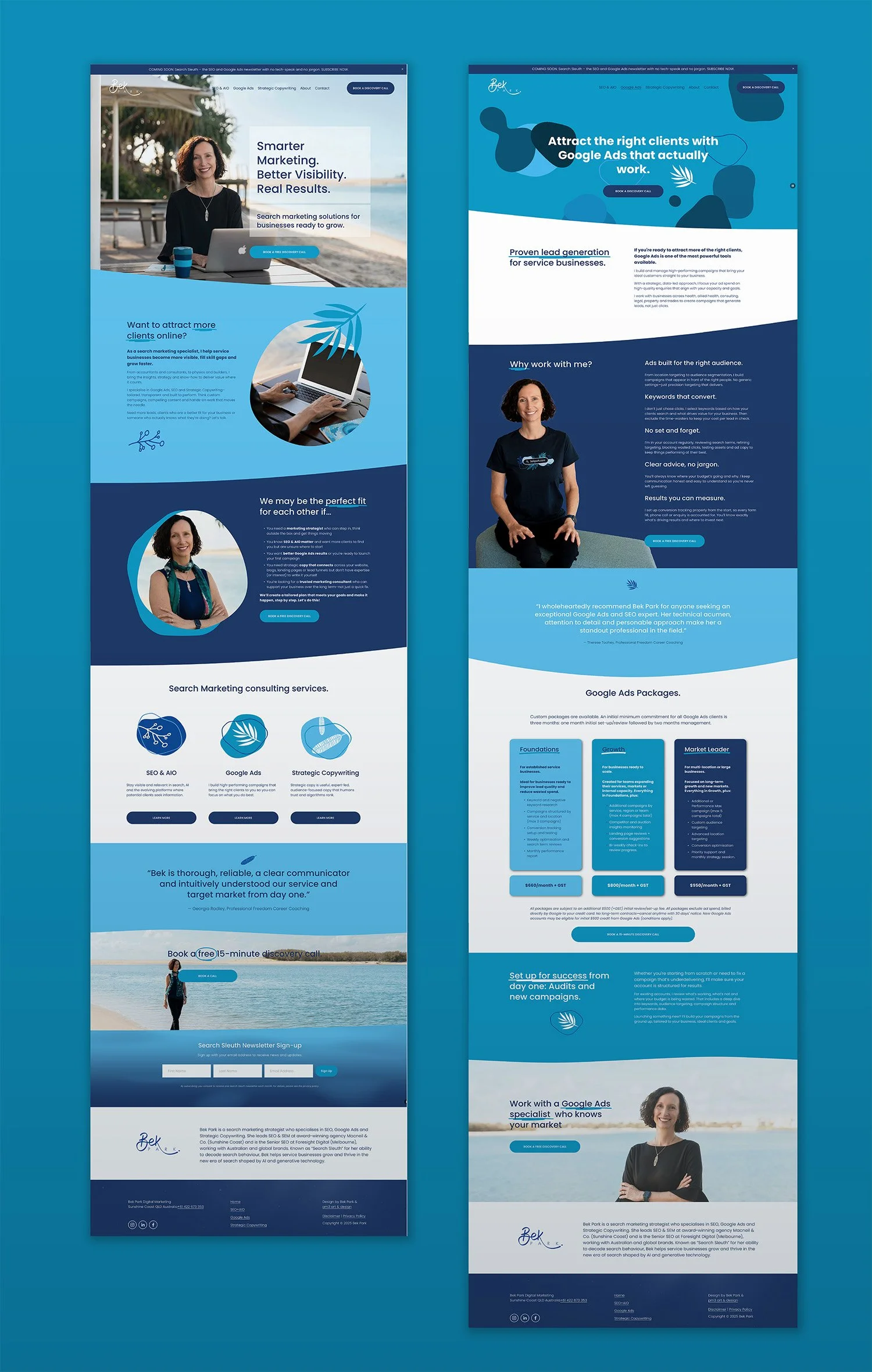
Most recently we’ve been working together on a whole new website to reflect Bek’s evolving brand and the changes in her industry. Having an up-to-date, easy to navigate website is imperative for Bek given she’s a digital marketing specialist in SEO (Search Engine Optimisation) and AIO (AI Optimisation).
The initial brief was to use her favourite colour blue and, at this early stage of the brand, include a background texture Bek particularly liked, see below in Fig 1. In the early days Bek only required a logo, business card and website. However, as her business grew, we developed an avatar to use in her Search Sleuth newsletter banner (Fig. 2).
Like all brand designing, we began Bek’s brand with a logo which in her case was a styled version of her handwriting. (I often suggest this for businesses using their name given the uniqueness of our handwriting – no two are ever the same resulting in a totally unique design truly reflective of us. (See other examples here.) The brief stipulated use of her favourite colour blue and the inclusion of a background texture she particularly liked, see below in Fig.1

FIG.1
More recently Bek decided to drop the textured background and instead sought a variety of graphic assets to use as branding elements. We drew inspiration from Bek’s local area and developed an expanded colour palette of blues and teals, along with graphic elements that reflected the natural coastal environment of the Sunshine Coast. The latter was pretty extensive and needed to be documented in some way, so we created a catalogue of graphics and a mini styleguide , see Fig.3
You can check out both the Search Sleuth blog banner and the brand assets in action on her newly launched updated website here.

FIG.2 Bek Park Search Sleuth blog banner
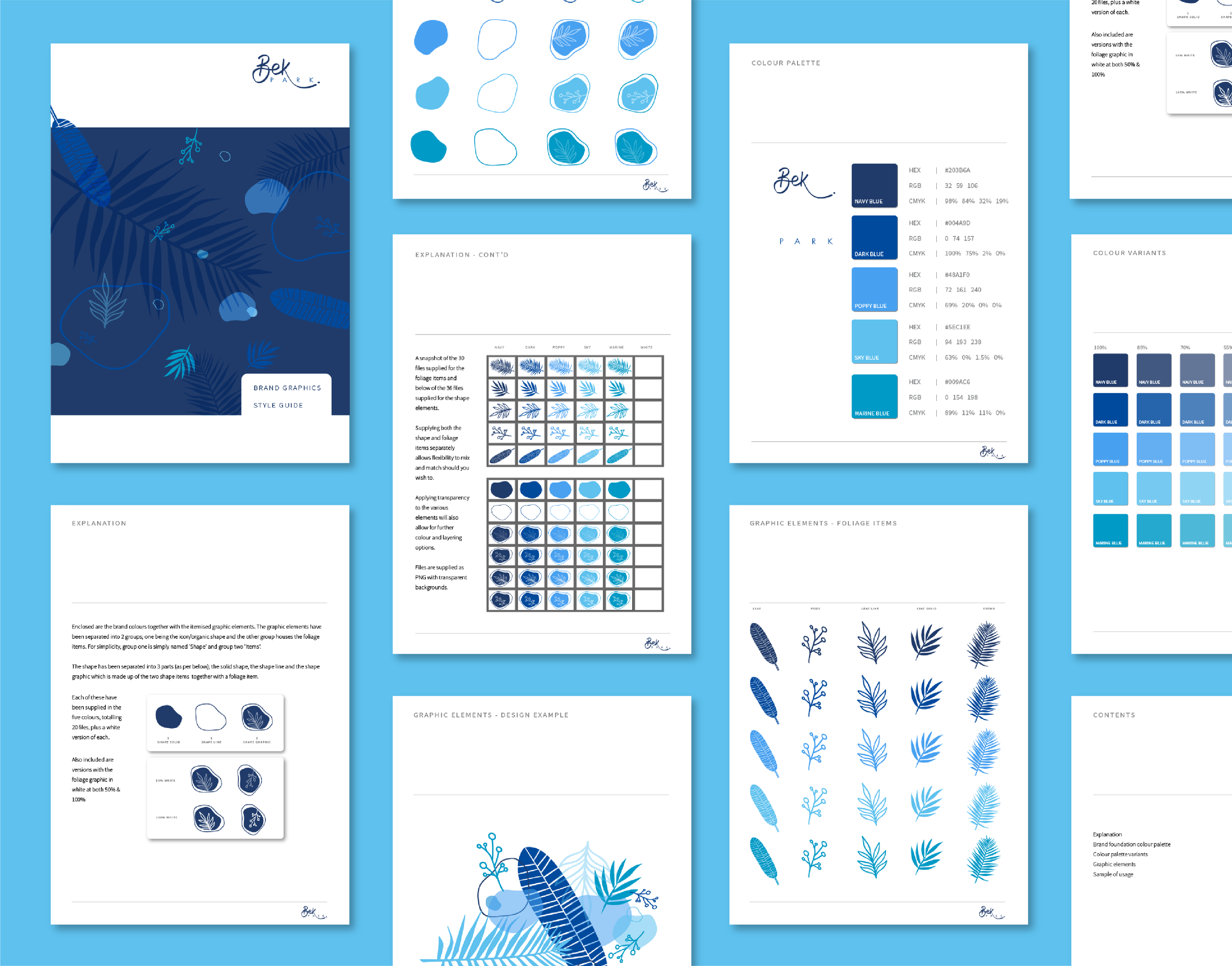
FIG.3 Bek Park catalogue of graphic assets and colour palette
FIG.4 A GIF demonstrating how to use the graphic assets
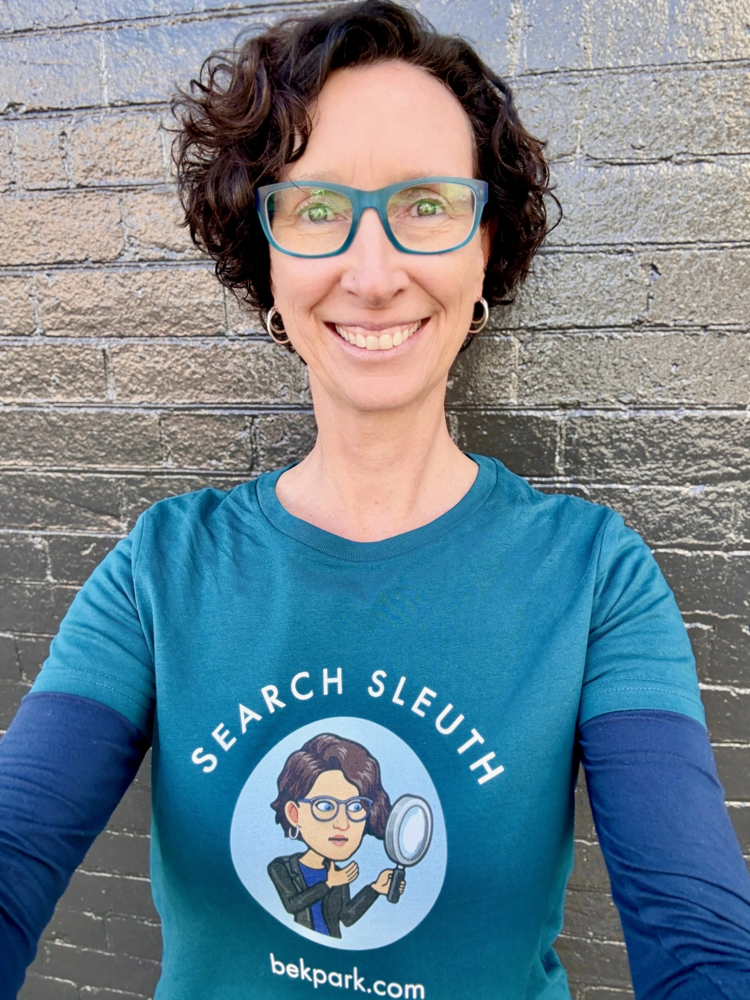
Bek loved her Search Sleuth avatar so much she wanted to print it on a tee shirt, however the avatar was originally created online and customised in photoshop with end use for digital purposes only, consequently the resolution was too low for printing purposes. To solve this issue we needed to convert the digital file (Raster) to a printable version (Vector). This is a relatively easy exercise, however it requires a lot of tweaking to bring it up to scratch, and when I say ‘a lot’ I mean 2-3hrs depending on how fussy one is about detail, hence we agreed on the full 3hr quota. See fig.4. An online converter was also investigated but the uploading process failed – perhaps a less detailed image might have been successful.
LEFT: The ‘before’ raster image revealed heavy pixelation and needed to be cleaned up and converted to vector. RIGHT: After the image was traced in Illustrator, cleaned up and converted to vector.
The brief for the tee shirt went like this:

The brief changed when the designer in me knew we could come up with something equally simple yet a little more ‘tee-shirty’ and offered the below which, while it was outside the brief, she thankfully loved. Bek loved it so much she had a second tee shirt printed and placed the design loudly and proudly on the front. Below is the happy customer wearing the end results.
Amongst all of the above, the website was being updated complete with a professional photoshoot with beautiful new images, and please note the detail Bek went to with the styling – ensuring her outfits encapsulated brand colours together with the props (ie the keep cup and notebook). It’s these details that enhance and strengthen a brand resulting in visual cohesion across all collateral.
A great collaboration and a great end result.