Print files vs Screen/Digital files

I could go into the technicalities and theories of colour but that’s a whole other complex story (if you’re really nerdy you can read all about here. For now, let’s focus on the basics that affect file types and their uses.
The file types for print are high resolution and saved as jpegs, png*, eps* and pdf* in 300dpi/CMYK .
OK we’re getting technical already, let me explain, 300dpi is a printing term meaning 300 dots per inch. (Yes, from the olden times). It’s the industry standard for all print media, so that magazine on the coffee table? That’s printed in 300dpi, which is why the pictures and text are clear and crisp and the colours are true.
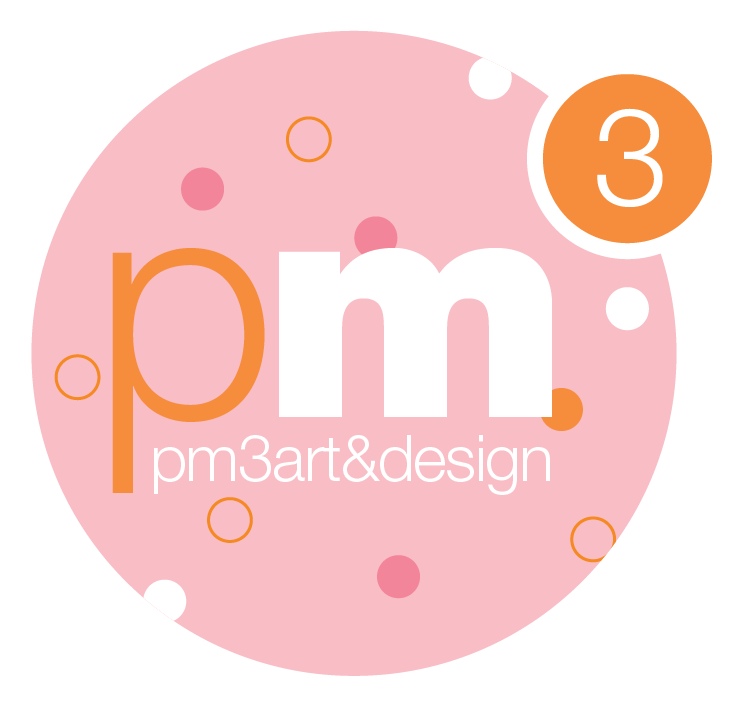
CMYK is the four colour (or full colour) print process and stands for; Cyan, Magenta, Yellow and Black. Whilst it comes out perfectly in the print process, if you try them on digital platforms, they will appear very bright, yet pale and inaccurate. The following images demonstrate the difference: the top image file is saved for print in CMYK while the bottom is saved for screen in RGB and displays the brands colours correctly.

Above; a print file saved in CMYK displays the brand colours incorrectly, while the image below is saved in RGB and is displaying the brands colours correctly.

The SHIFT Projects Facebook banner correctly displayed for screens in RGB
Screen/digital files are low resolution and saved as png*, jpeg and svg* at 72dpi/RGB. So, less dots per inch means lower resolution, it’s a bit like a magnification or clarity measure.
These digital files are saved in RGB which is Red, Green and Blue (like the old colour television tubes). They cannot be used for 4 colour process printing for, as you’ll know now you’ve read this, obvious reasons. Square peg round hole anyone?
If you use a digital file for print it will come out grainy, out of focus and the colours will be a mess and you’ll also get red, green and blue shadows. Basically, don’t even think about trying it.
Phew, so that’s an insight into what happens after you’ve signed off your logo, it’s where the work begins after the creative process.
* PNG’s have transparent backgrounds, EPS’s can only be opened in design software, SVG’s are scalable vectors for digital use.