Colour me Purple – or in this case, green!
Pantone colours
You may have heard your designer or printer ask for the Pantone colour or PMS code when you’re doing a one colour print or choosing a strong brand colour.
The Pantone company cleverly devised a universal colour matching system for printers and designers to specify and control colours for printing projects eg: if you have a specific PMS red in your logo, by having that code it will be the same red that’s used across all your print and production. A great system that avoids a nasty salmon pink disaster if someone tries to match it onscreen. Phew!
The image below shows a Pantone solid colour mixed in CMYK – you can see they don’t match perfectly.

In many cases this option works just fine and is the more affordable option, however, there are times when you really want your colour to pop.
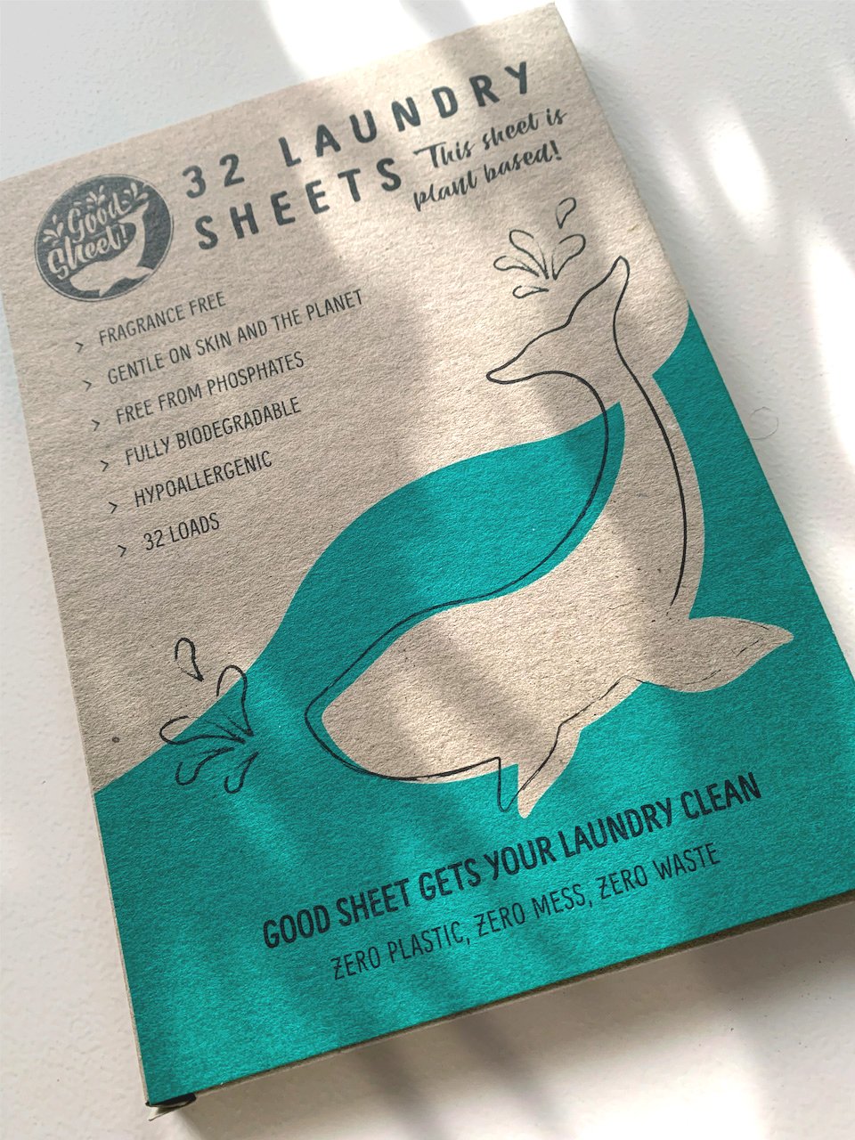
Below is an example of The Good Sheet packaging. This job definitely needed the PMS option especially because it was printed on Kraft board which is darker than white card stock. To really make the colour pop, white was printed as a base coat and the Pantone colour printed on top. The result? A packing that really stands out on the shelf.
Now you know a bit more about print and colour you can understand more of what your designer and printer are talking about instead of thinking they’re speaking in code.